The Problem
One-stop shop
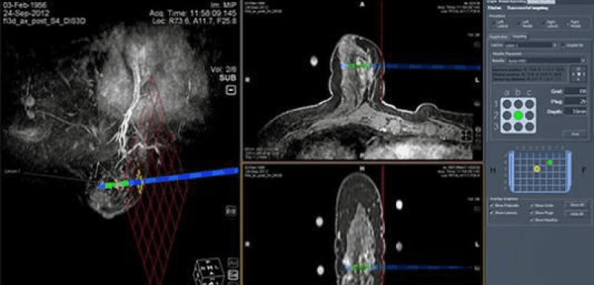
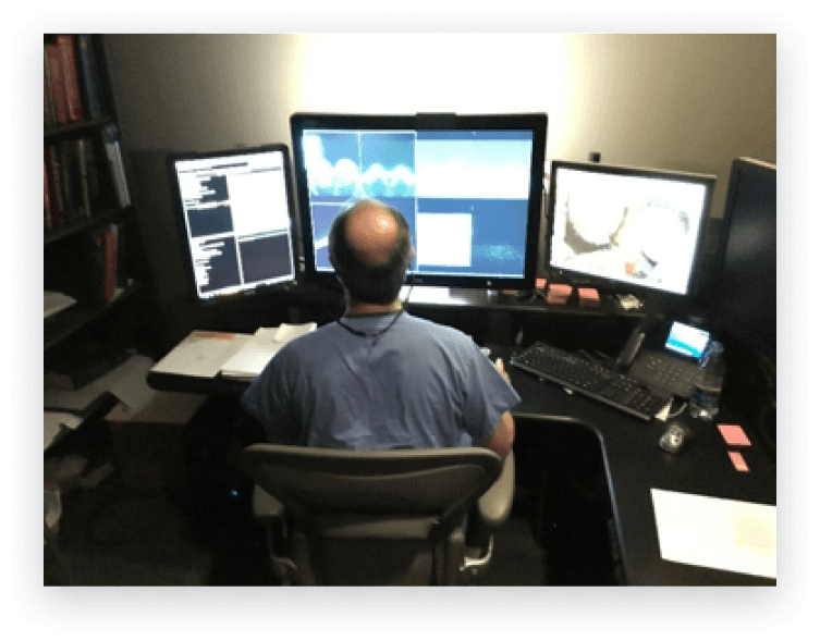
Traditionally, analysing and diagnosing images of different modalities require multiple monitors and control panels – dedicated monitors and keypads/keyboards for each modality. This can lead to cluttered work spaces and inefficient work flow. Hologic offers diagnosing products for each of the breast imaging modalities – mammograms, ultrasounds, and MRIs. Each of the modality products come with their own set of usability issues that required improvement before combining all modalities into a single solution.
For the purpose of this case study, we will be focusing on MRI.
Design goals
Create a seamless experience to view and diagnose multiple modalities in a single workstation.
Business goals
Be the first to provide a single-source workstation, which would allow radiology centers to streamline diagnosing time and reduce cost.
DEFINING DECISIONS
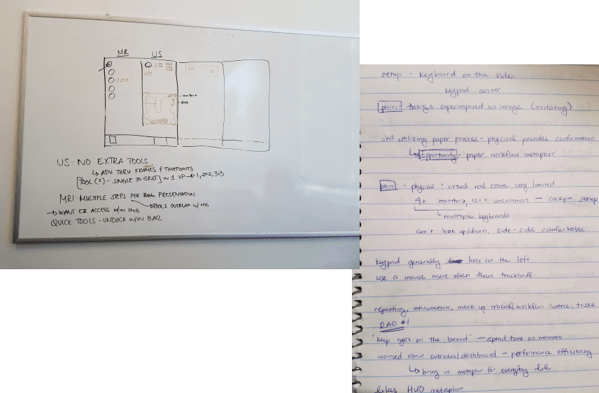
Pains and opportunities
Evaluating the existing MRI software, what are aspects we can improve upon as we migrate the features into the unified product?
Allow for easy modality comparison
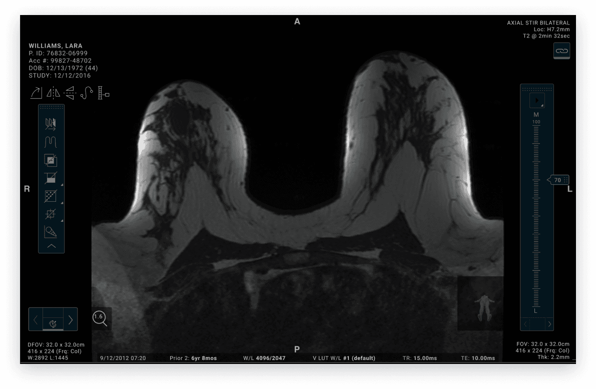
Consolidating all modalities into a single product allows radiologists to reduce the amount of monitors required to compare images. However, this also means all information needs to be easily readable and avoid information overload.
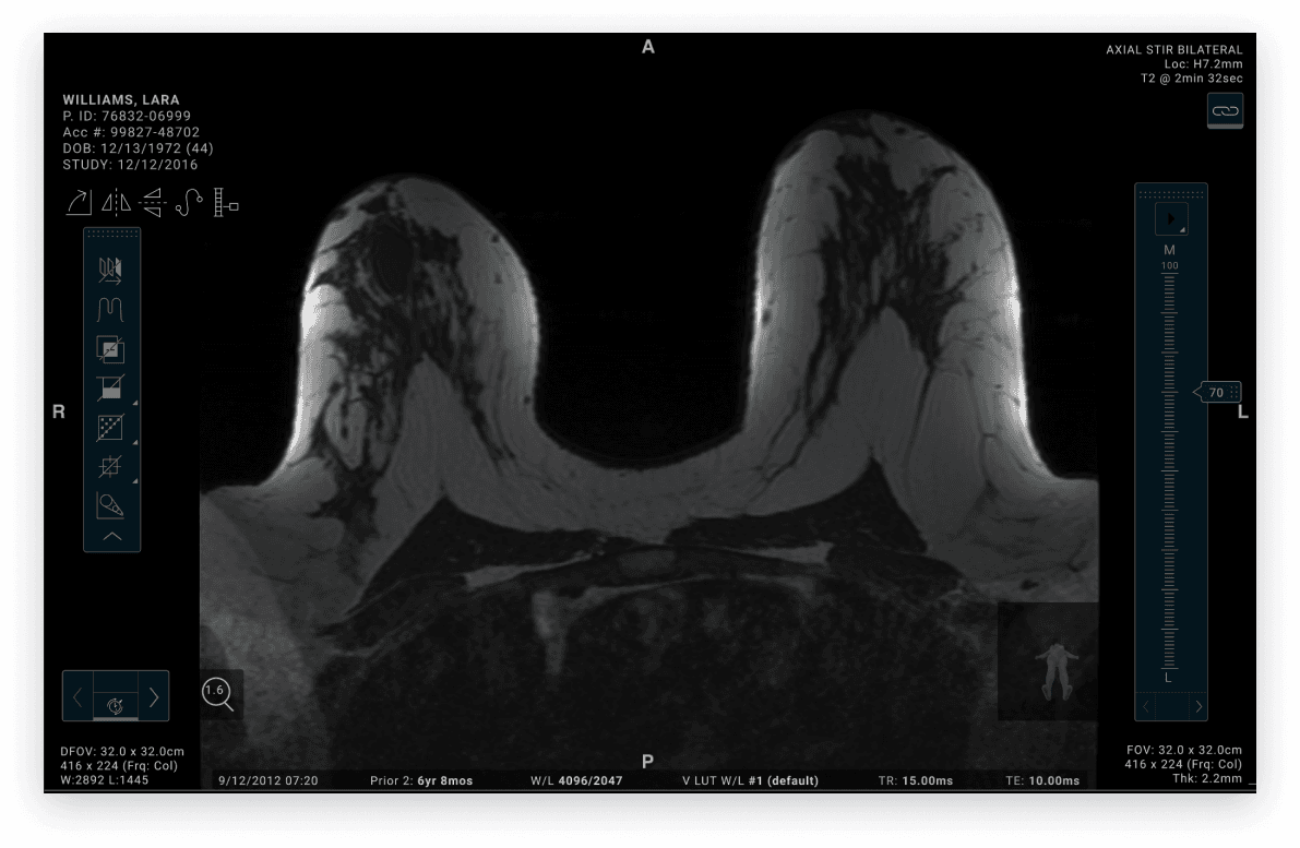
Due to the amount of information that needs to be overlaid on each image, there was very little real estate left to display custom tools.
Due to the size of the monitors (3073×2050) required to view radiology imaging, cursors often travel great distances from accessing a tool to marking the image. In the new design, there needs to be much consideration to reduce this distance and provide easier access points.
FIRST DRAFT
Let's brainstorm
Currently, there are multiple access points to use a tool
All of the access points to use a tool sit outside of the viewer and requires significant cursor travel.
Tools are not in any organized fashion; so users had to memorize where all of their tools are and the order of tools in their toolbar.
Lack of customization for radiologists to make their workflow efficient - efficiency is the most important aspect of a radiologist's workflow.
Initial wireframes
Usability testing
Validating assumptions
Participants
What worked well
Easy access to tools via the collapsed toolbar that lives within the viewport
Ability to read and manipulate MRI. images in teh same system that includes mammograms
Ability to have both kinds of images side by side so areas can be correlated
Tools are robust, users did not mention any tools that were missing
Participant suggestions
Overall consensus that participants liked the toolbar
Mentioned that learning the meaning of each icon would take time
Wanted more robust functionalities that allow more powerful diagnosing workflows
