The Problem
When does a product suite become too much?
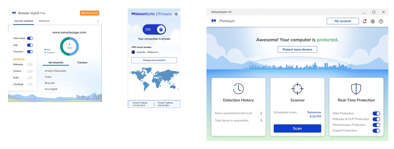
Currently, Malwarebytes offers a suite of security products that customers can purchase individually or through bundling. However, regardless of purchase method, customers are required to download each product separately and activate each one individually. This caused confusion amongst our customer base, which lead to an overloading demand on our customer support system.
Can you imagine buying all these products from the same company, but maintaining individual licenses and individual subscriptions? What a headache!
Design goals
Create an easy and intuitive experience that motivates users to be proactive in keeping their devices and online behaviors safe
Business goals
Reposition ourselves as a personal security advisor that drives up engagement and maintains retention
DEFINING foundation
How do we unify products created in silo?
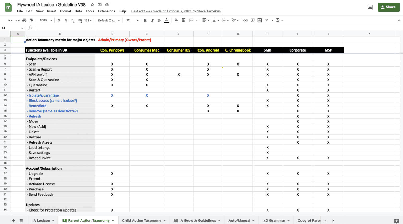
In order to understand the overlap in functionality between products as well as prioritize features, it was necessary to create a master architecture. To ensure that all features and functionalities were represented accurately, it was important to define the taxonomy in which to start categorizing. Some of our products were built based on features being objects for users to use (nouns). Others were built based on actionable tasks (verbs). For the purpose of this exercise, we sorted features as actionable items. Those that were defined as objects were re-labeled so that they fit the verb structure.
Persona
Roadmap
Pillars for decision-making
Evaluate MVP vs True North
Knowing that this is a brand new product that requires complete overhaul effort from developers, how do we design in a scalable manner that allows for seamless iterations?
Because of the aggressive Go-To-Market plan and the monstrous effort required of developers, design was pressured to deliver as early as possible to allow room for iterations and redirections.
Design for all users
How do we address the needs of an average user who is casual about their cybersecurity while also providing enough information and features to our advanced user who is proactive in keeping their (and their loved ones’) devices safe?
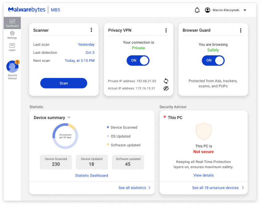
first draft
Let's brainstorm
Fill in the gaps with a heuristic evaluation
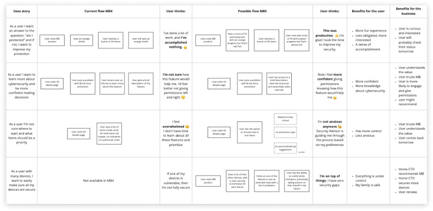
Forced non-designers to move through a design-thinking/Jobs-to-be-done process
Benchmarking and validation
Data-driven decisions
UX research
Participatory design
Insights on our benchmark
Some participants self-reported themselves as “very knowledgeable” about cybersecurity but struggled with expressing their thoughts and needs in detail, suggesting they may be “less knowledgeable.”
We did not meet participants expectations to provide additional information and guidance.
Clear direction
Personalized recommendations to increase users security and privacy
Succinct education on product features and strategies for increasing users’ security and privacy
Clear actions for users’ next steps that address recommendations to increase their security and privacy.
Friendly, personable tone of voice
A friendly, gentle, and informative guide across the unified application
An adaptive and personalized experience across the unified application
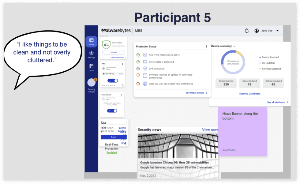
Second draft
Making some changes
Pros:
Cleaner look and feel informative
Cons:
Not scalable
Potentially information overload
Does not align with the mental model discovered during UX research
Proposed draft
What we proposed in our storyboard
Changes to note:
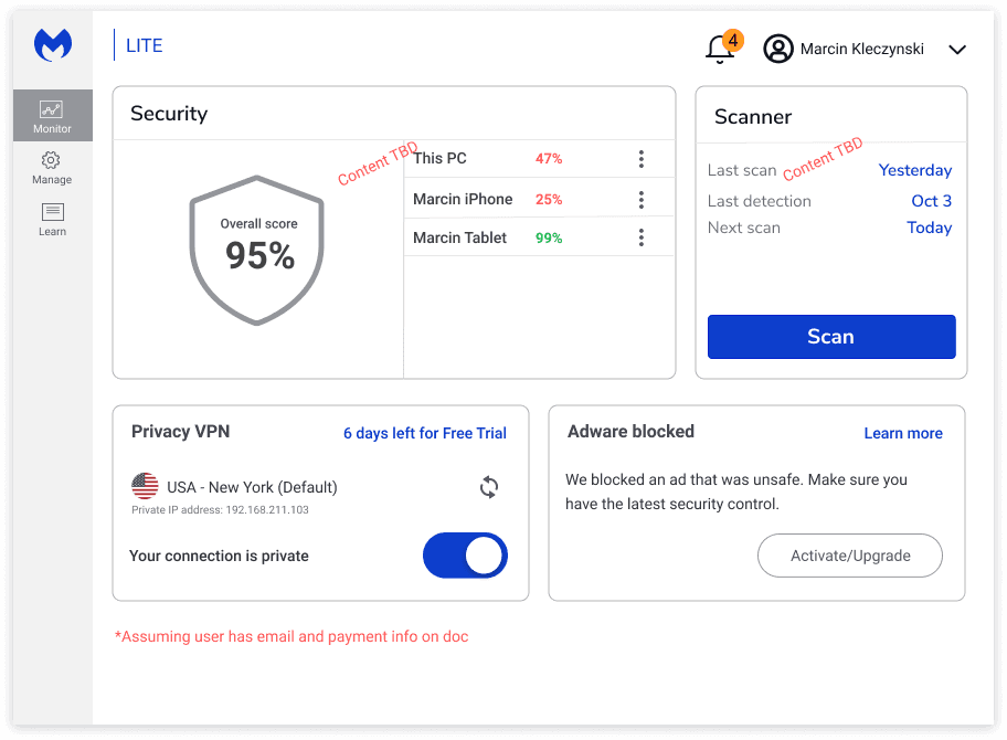
Simplified the information for casual users while still allowing expansion for detail for power users
By having rows instead of cards, we allow better scalability through vertical scrolling
Recategorized the information to align with how users perceive security
Provide a better educational and approachable experience to viewing your device security scores.


